
HOW MALAVENTURA HAS AROSE IN CRAFT BEER MARKET
In Latam we are beer enthusiasts, it must be said, we do not hide our predilection for it, we have become a perfect companion in social events, meals, with friends, during and after football and even as a reward for a hard day's work, that sometimes is not so hard, but it's still worth it. For decades our beer consumption was easy and it was enough to choose between "blonde or brunette", that's how easy our life was. However, as the only constant in life, everything changes.
Our passion and taste for beer, We deserve more than blondes or brunettes? What other types and styes of beers would we like?
The national craft beer market has spectacular growth and consumption numbers, clearly it is a segment that comes with its own rules, a new brewing culture in the country and a renewed consumer, young, daring, adventurous and explorer with thirst for new experiences, flavors and ingredients, their own rituals, understand that and how to drink, look for brands that contribute to their "personal branding" and help them differentiate themselves. With this in mind, is that a group of entrepreneurs passionate about quality beer have decided to create their particular vision.
The objective: to generate a brand that manages to connect and satisfy this new consumer, who feels that this is his beer. Together, Brandmaster and the team of enthusiasts developed the brand: Malaventura.
– Branding & Naming –
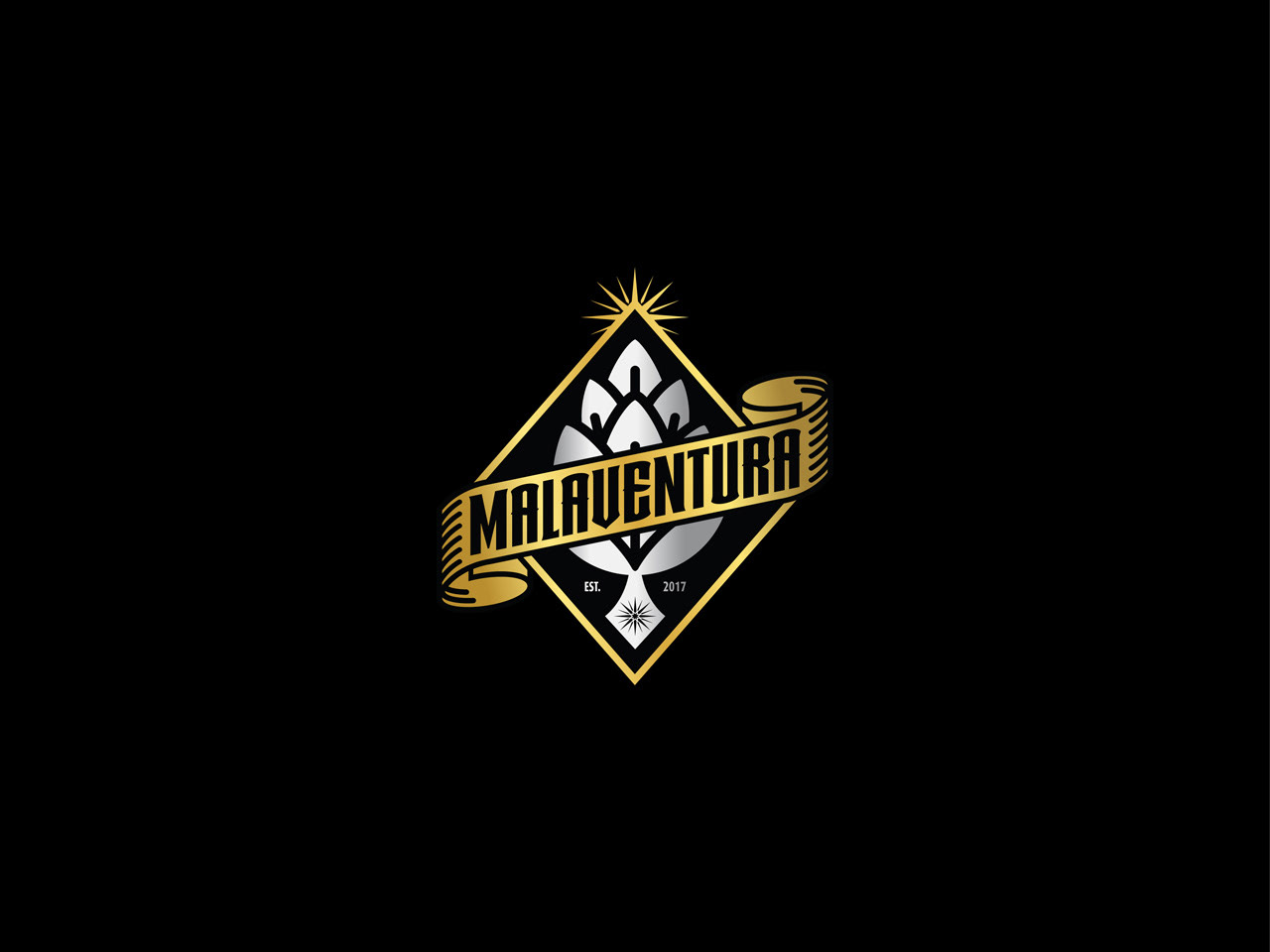
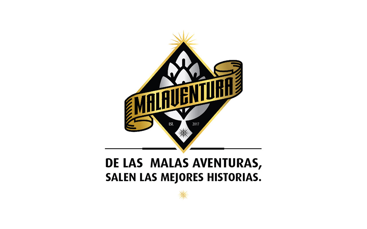
MALAVENTURA
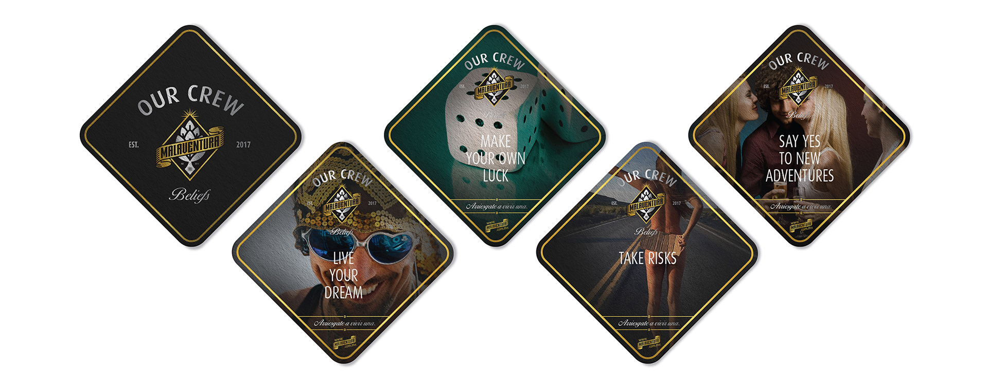
We look for a personality that will distance us from traditional options, a personality that will reflect our essence and risky position, brave enough to start a new adventure and confront the challenges of the market. Because if you do not risk you doesn’t win, and it is not true that the best stories are created when we dare to live them. With this positioning we want to create an emotional connection with our consumer and why not say it, to be the emblem of a community where “malaventuras” and challenges shape our DNA.
Malaventura name adopts this idea that each adventure has a beginning and although sometimes it seems not to be the right one, you must dare to live it, take a risk, only then you will know how spectacular it can be. This approach clearly communicates our culture and philosophy of life.
–0–
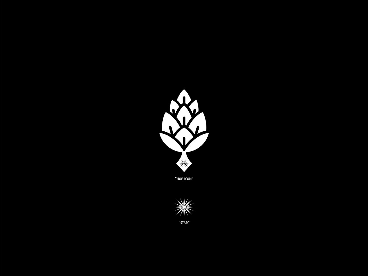
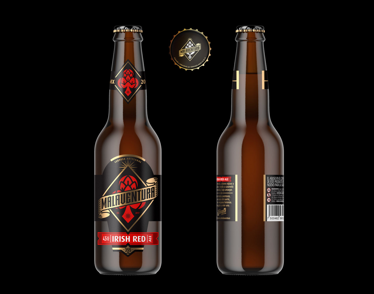
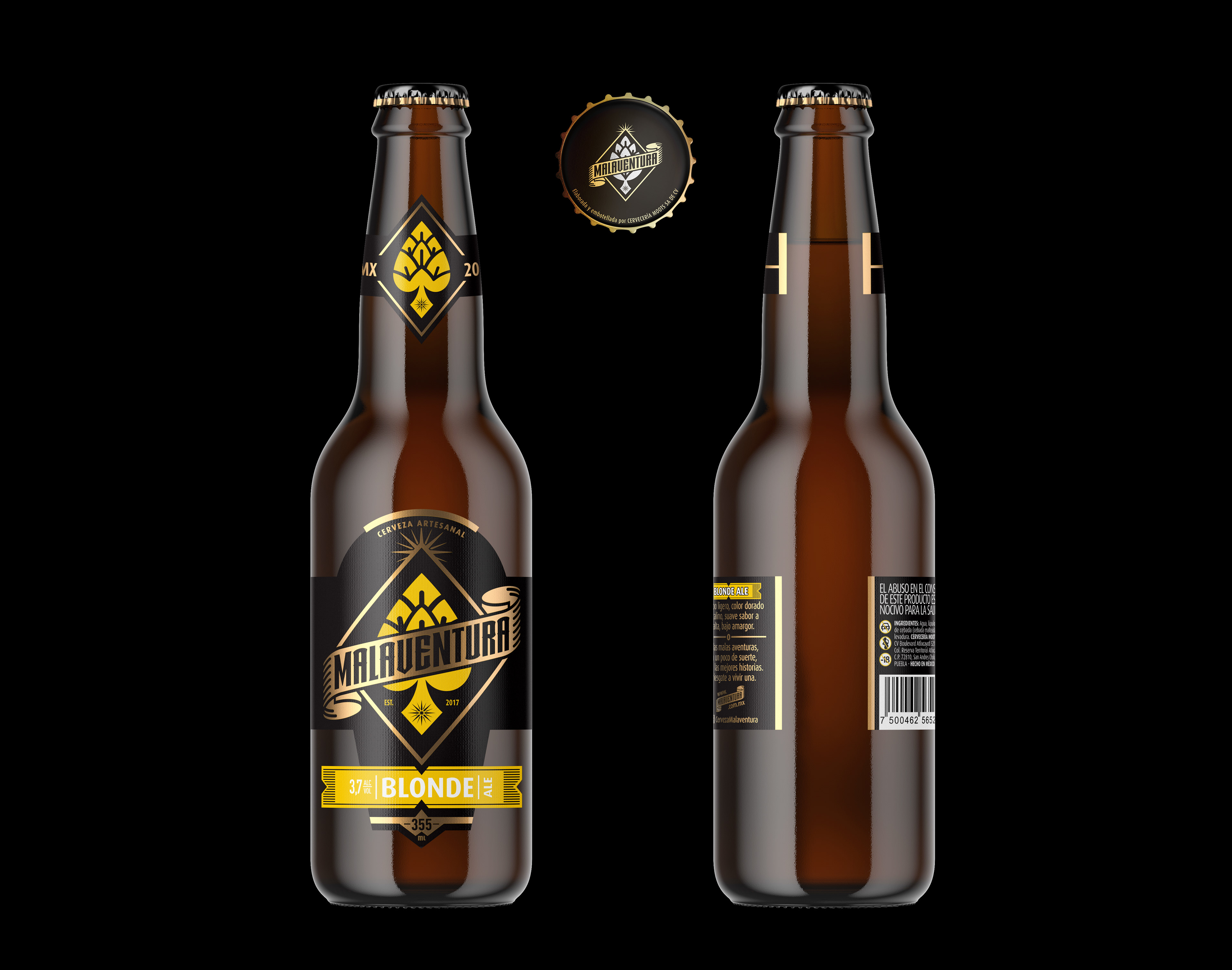
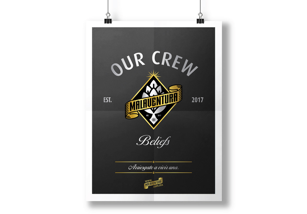
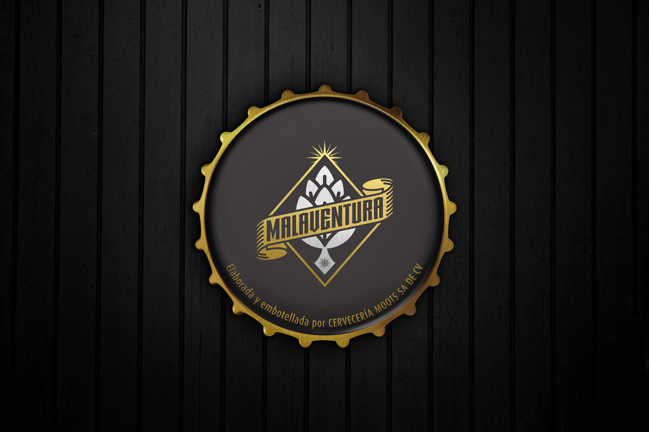
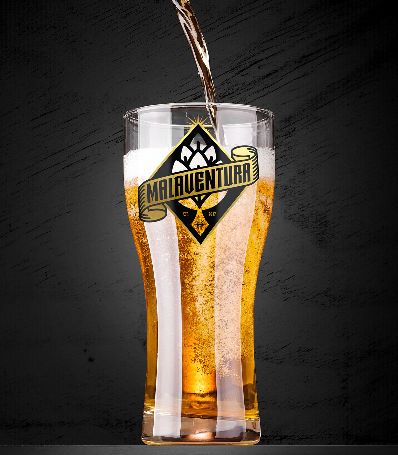
In the brand development process Brandmaster delivered analysis and strategy, naming, as well as brand and packaging design. We create a strong and clear custom graphic language, that is reflected in our main symbol "HOP ICON".
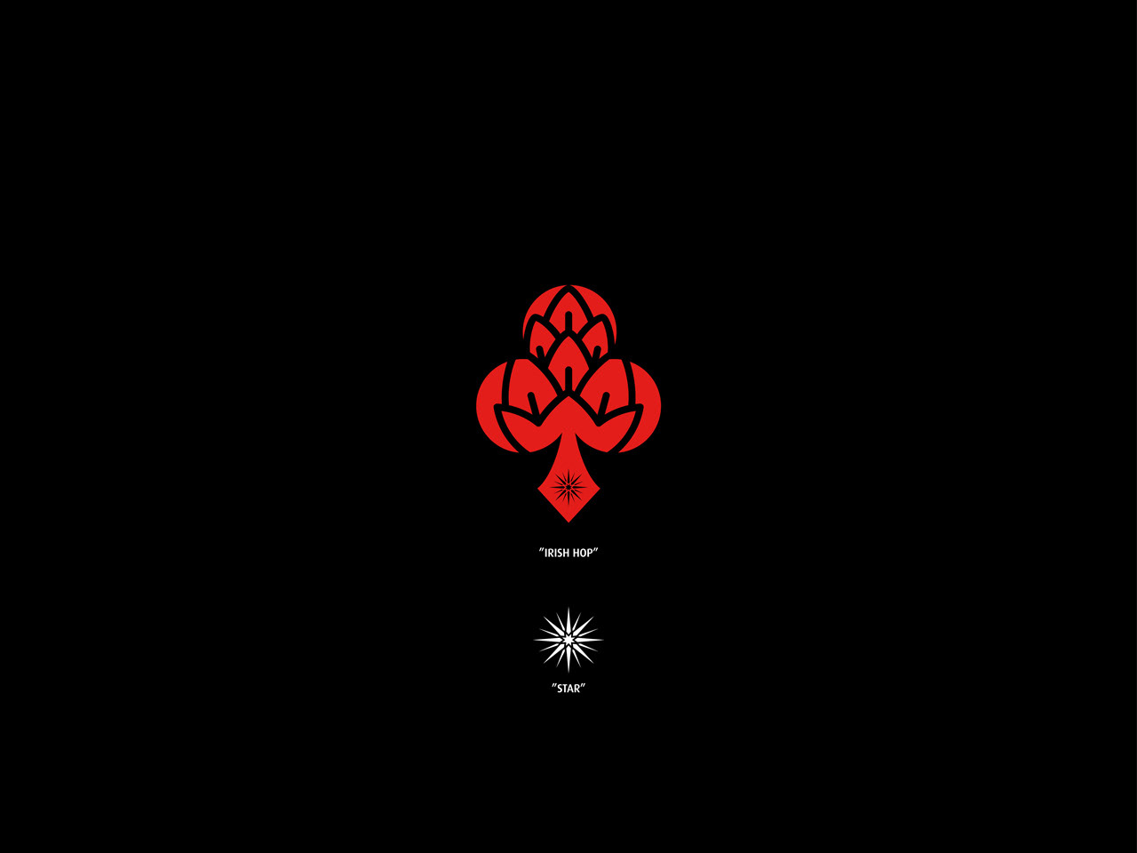
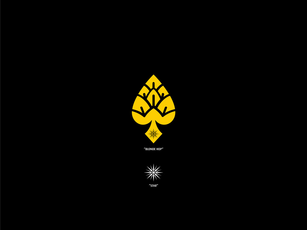
With the aim of representing and emphasizing the personality of each of our beers, we decided desig a series of new icons under the same style, thus creating a more complete graphic language.
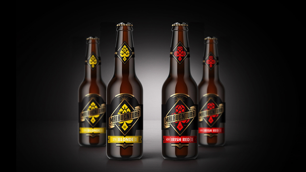
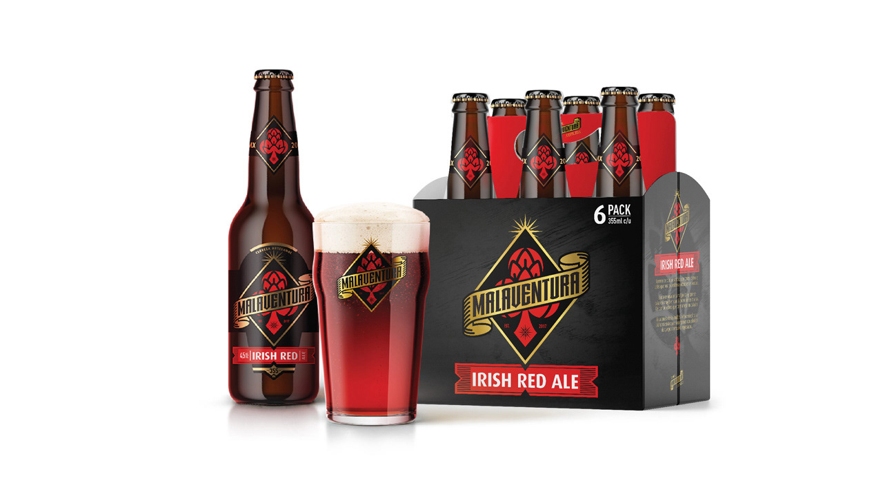
– Packaging –
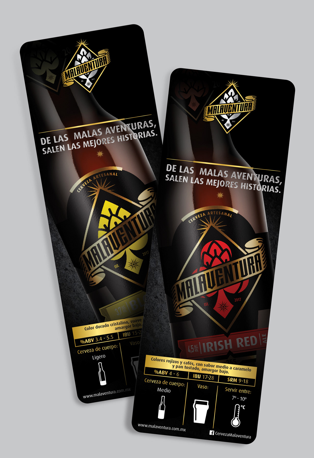
OURS BEERS & TASTINGS
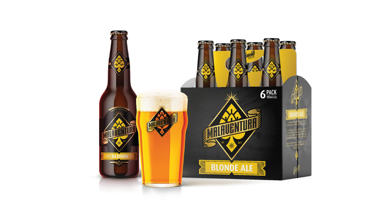
Within the portfolio, it was important to develop a packaging architecture that will prioritize a excellent brand exposure, in addition to a clear communication that allows easy navigation within the beer options we have, and in the future, we will build.
–0–
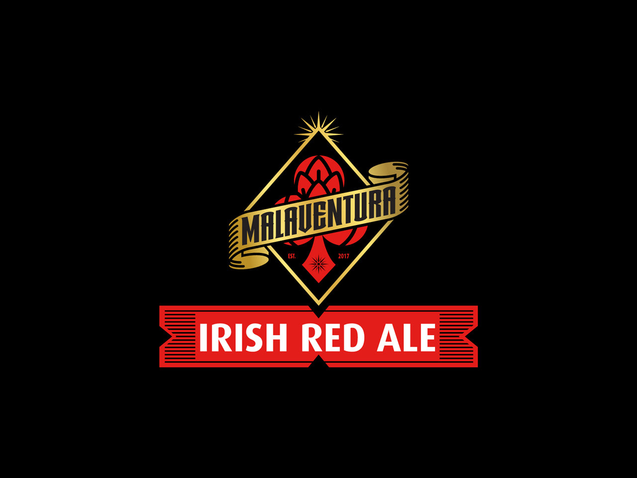
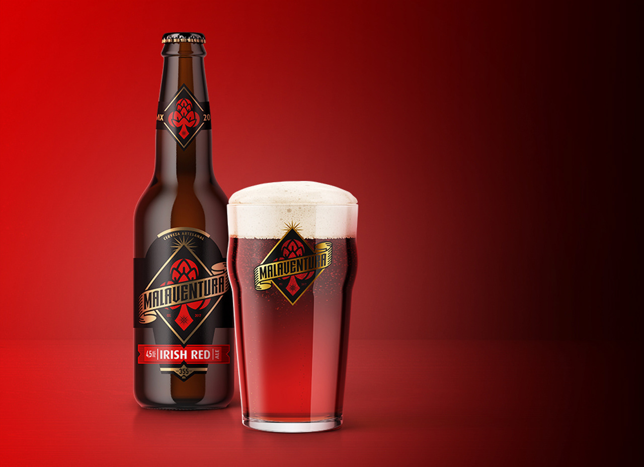
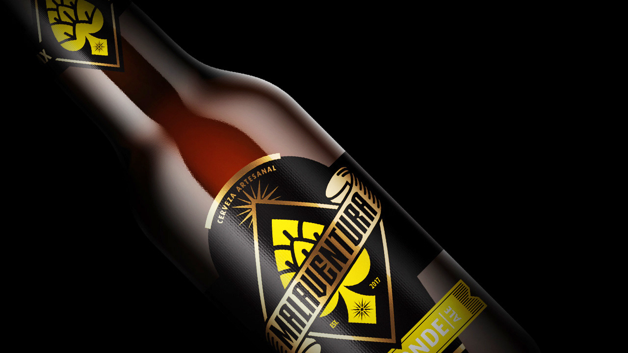
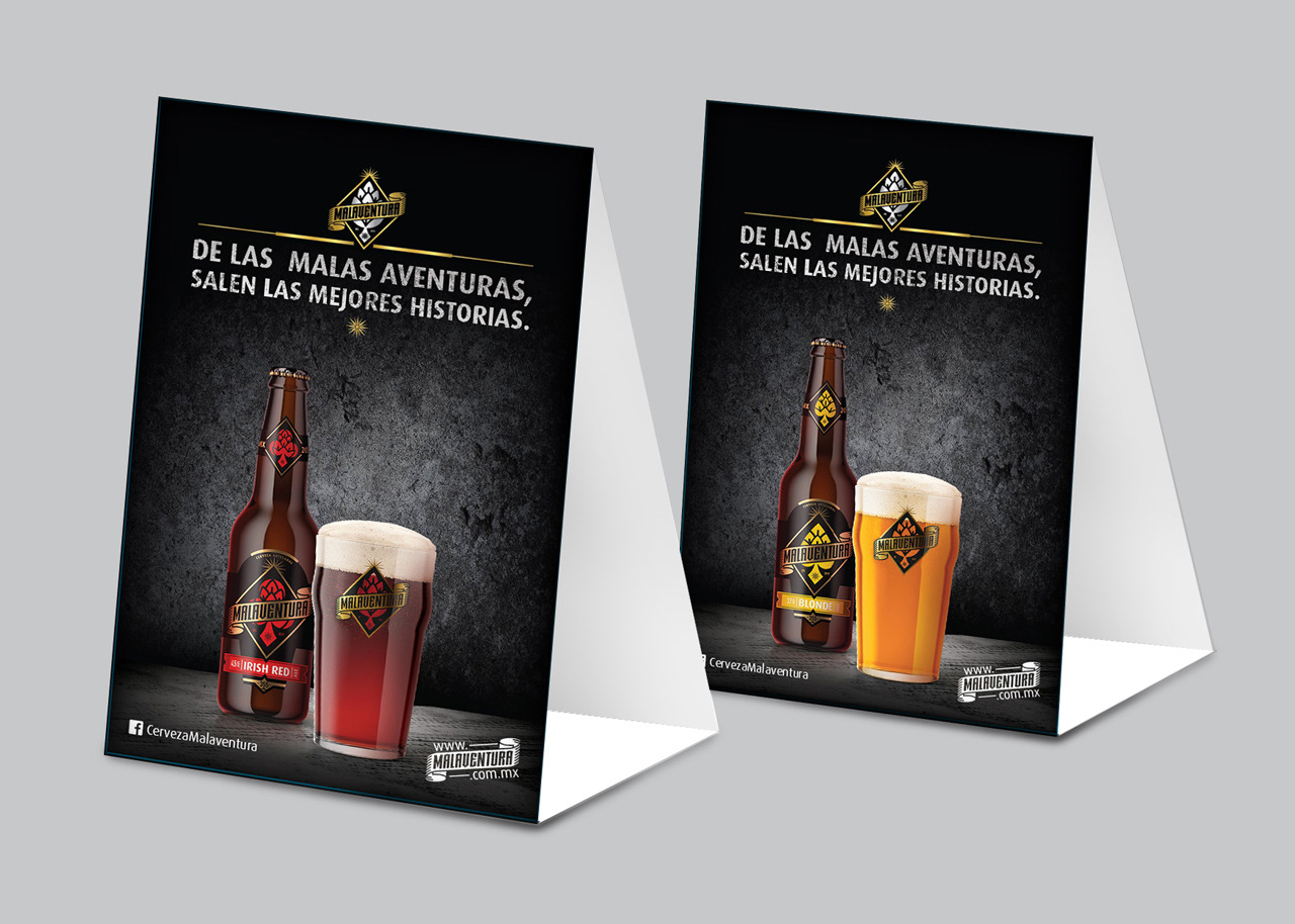
– Irish Red Ale –
"Low bitterness beer, sily body with reddish and browns tones that remind us of autumn in the forest and swings with the sweetness of the malts"
–0–

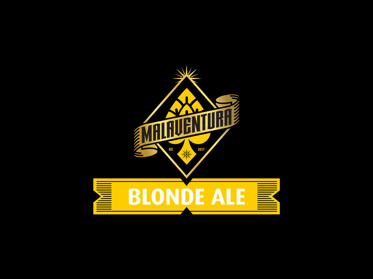
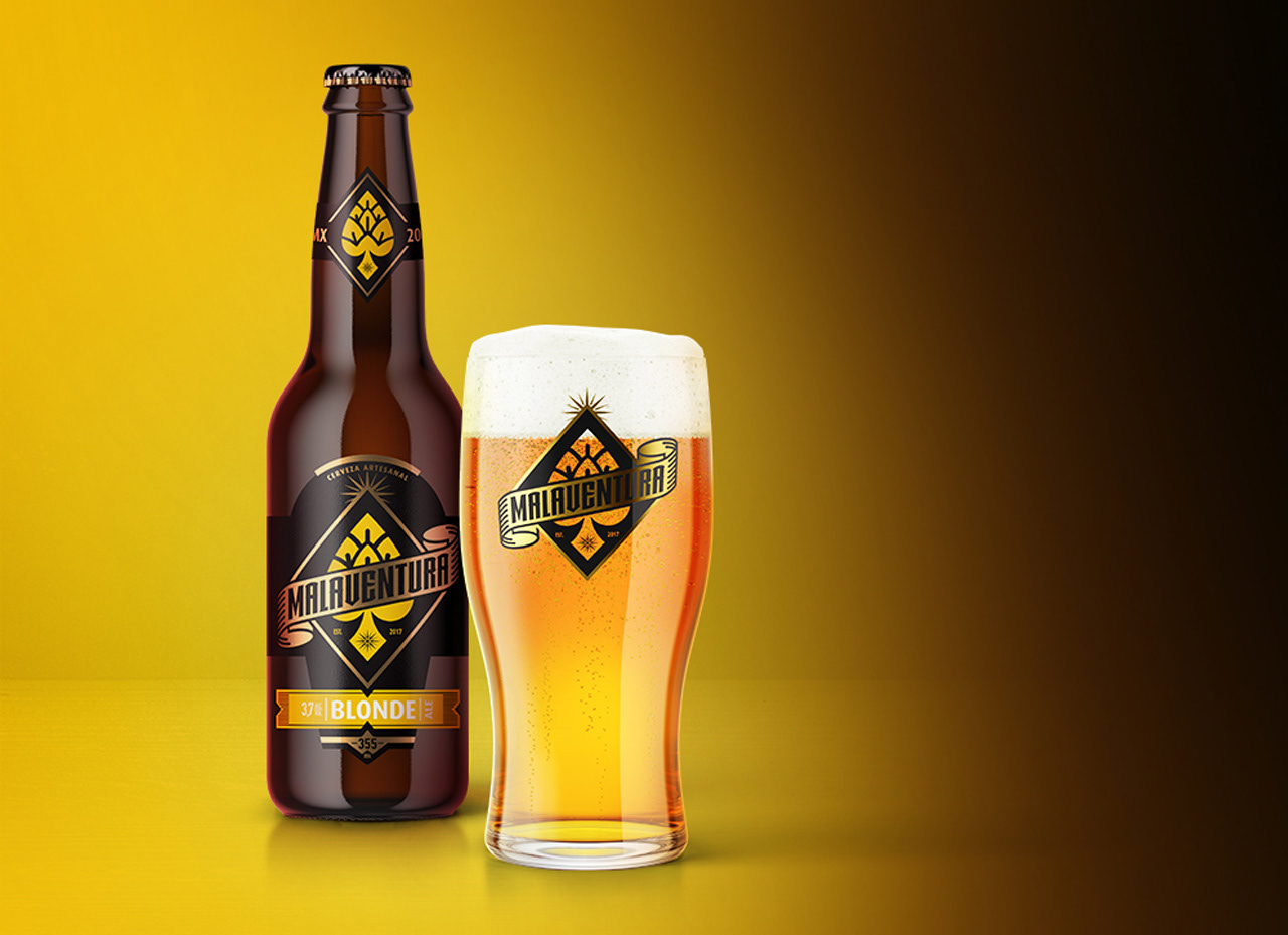
– Blonde Ale –
"The golden tones remind us of wheat fields ready for harvest. With aromas of hops and tropical fruits it surprises with a tenuous bitterness, an ideal beer for hot days"
–0–
– Brand Applications –
MALAVENTURA COMES ALIVE
–0–
– In Store –
–0–
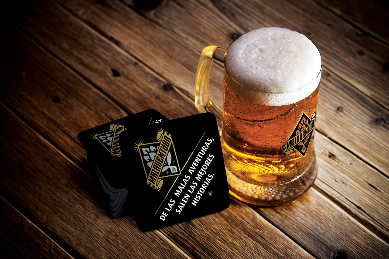
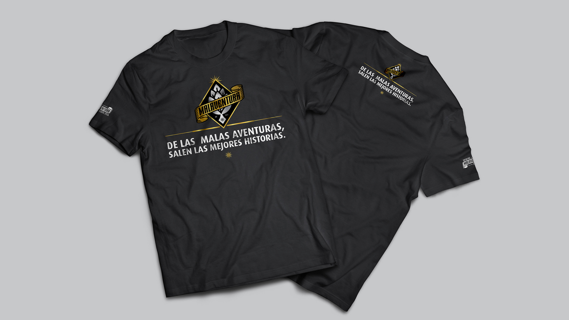
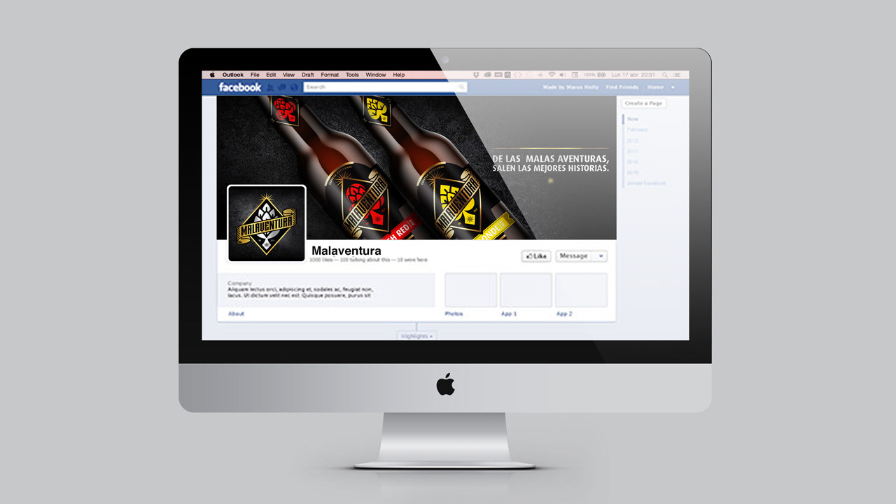
– Promotional Products & Social Media –
–0–
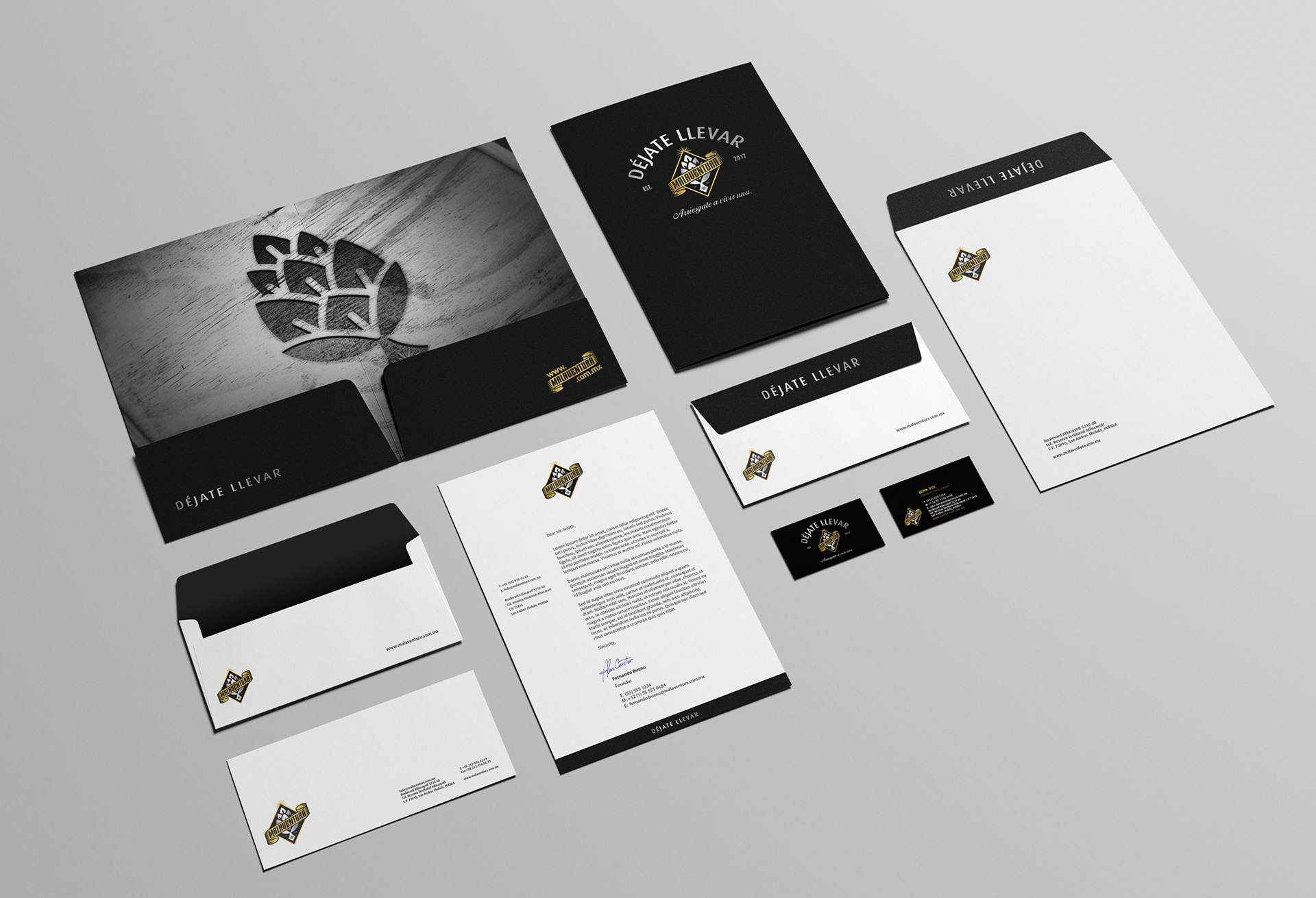
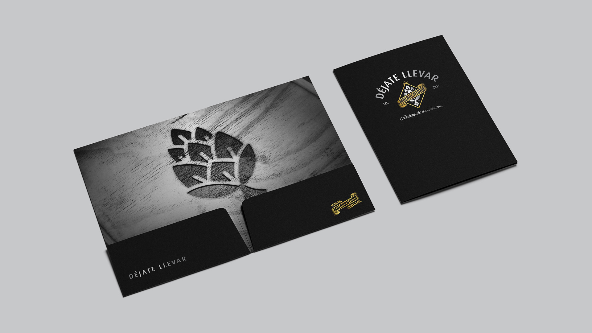
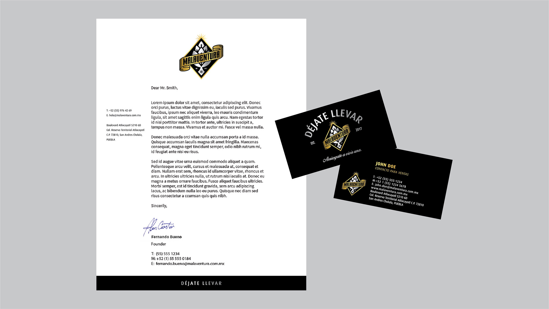
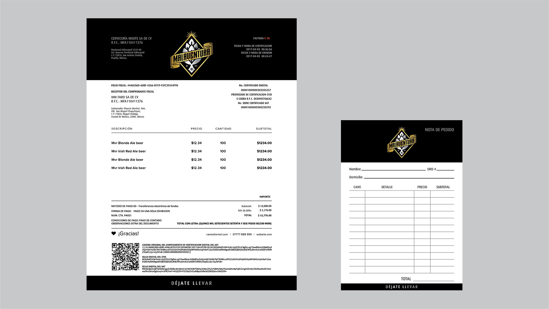
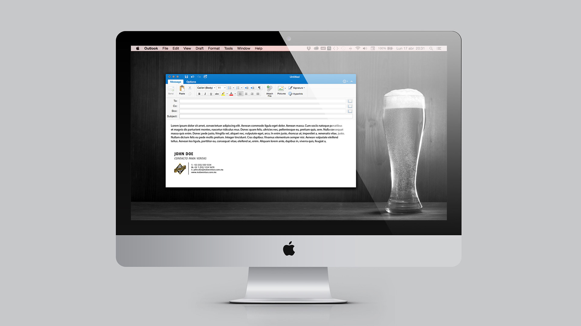
– Corporate Identity –
–0–
–0–
"Our Brandmaster team delivered the work to the client at the beginning of 2017 to start marketing. In just its first year, the CEO of Malaventura, Fernando Bueno Soberon, said that thanks to the excellent reception of the brand before the consumer and social networks, they were forced to triple the supply of production estimated for the first year."